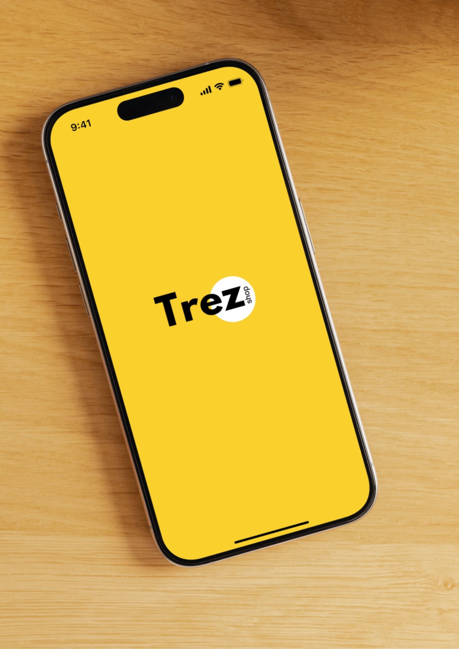
Trez Shop

Designing a modern ecommerce mobile application to offer users an intituive, personalized, and hassle-free shopping experience

Role

UX/UI Design Intern

Industry

Shopify

Duration

3 months

trez app
trez app
trez app

Stage 1. Ideation

  • The project began with a broad ideation phase, focused on identifying opportunities to improve the mobile shopping experience. I conducted market research, explored user behavior trends, and analyzed common frustrations with existing shopping apps. The goal was to envision a product that felt fast, simple, and enjoyable to use.

    During this phase, I mapped out potential features such as one-tap checkout, personalized recommendations, advanced product filtering, and a clean, distraction-free UI. I also explored how to make the app feel trustworthy and convenient — essential qualities in a mobile commerce experience.

Stage 2. Problem Definition

  • With a strong base of ideas, I moved into defining the actual problems users face. Through interviews and online user feedback, I discovered that shoppers often feel overwhelmed by cluttered layouts, get lost in product discovery, and abandon carts due to complicated checkouts.

    I defined clear problem statements such as:

    • “Users struggle to filter and find products efficiently.”


    • “Shoppers feel uncertain about product quality or authenticity.”

    • “The checkout process causes friction and drop-offs.”

    These insights helped narrow the design focus and ensured every decision was rooted in solving a meaningful problem.

Stage 3. Prototype

  • Using the defined problems and prioritized features, I created low- and mid-fidelity prototypes to visualize the app’s core flows. Key screens included:

    • A clean home page with curated categories

    • A fast, intuitive search experience

    • A product page with clear visuals and trusted details

    • A smooth multi-step checkout process

    This stage was focused on layout, structure, and user flow, not yet on detailed visuals. I used tools like Figma to create clickable prototypes and mapped out user journeys for typical shopping tasks.

Stage 4. Userbility Testing

  • conducted usability tests with potential users to observe how they navigated the app and completed tasks like finding a product or completing a purchase. I used a mix of remote testing tools and in-person sessions to gather qualitative and quantitative insights.

    Key findings:

    • Users appreciated the clean layout but wanted clearer navigation icons.

    • Checkout steps needed stronger progress indicators.

    • Some users missed the wishlist feature in the flow.

    Based on this feedback, I iterated on key areas to improve clarity, fix minor pain points, and fine-tune the user experience.
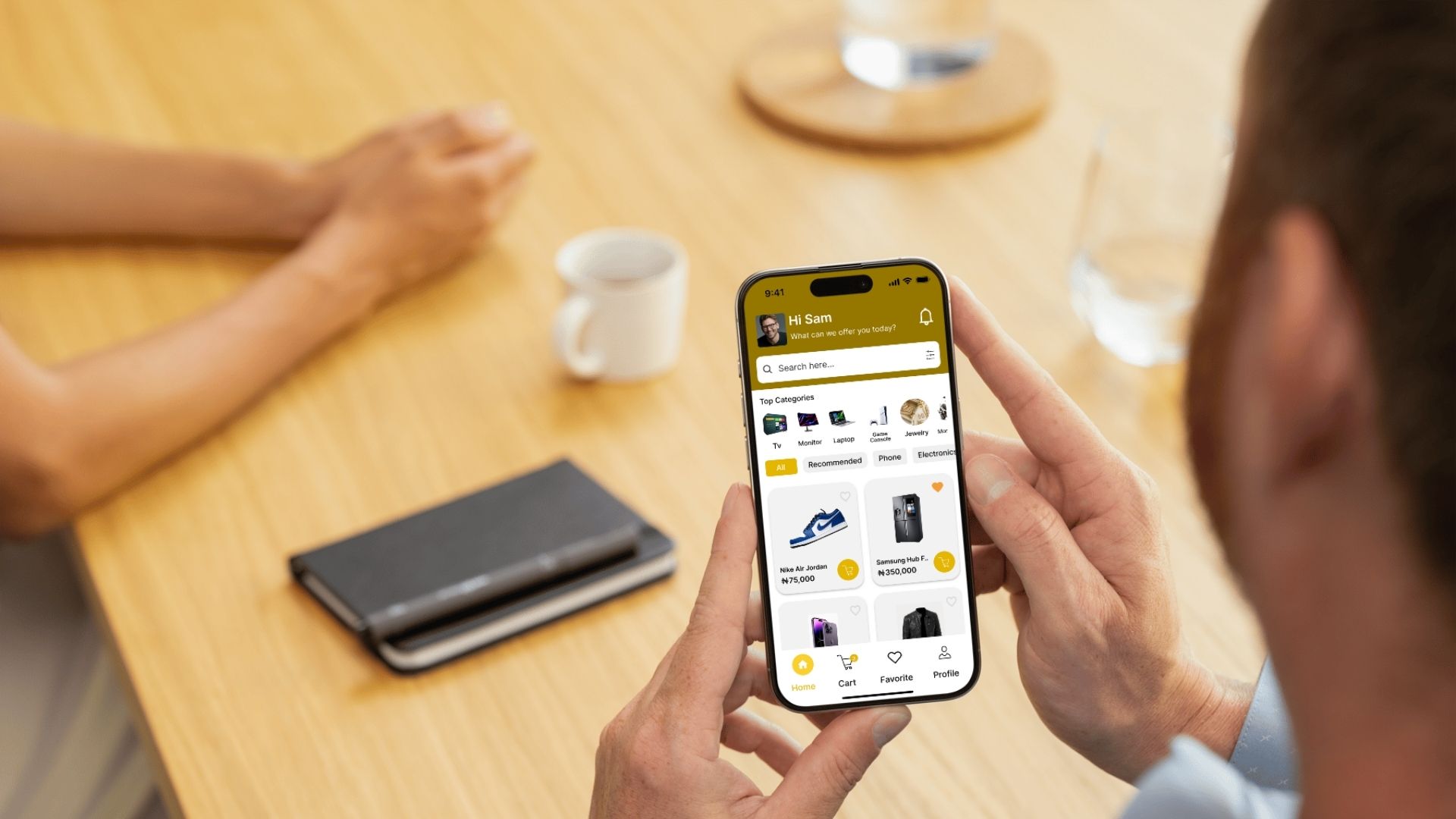
Stage 5. Design

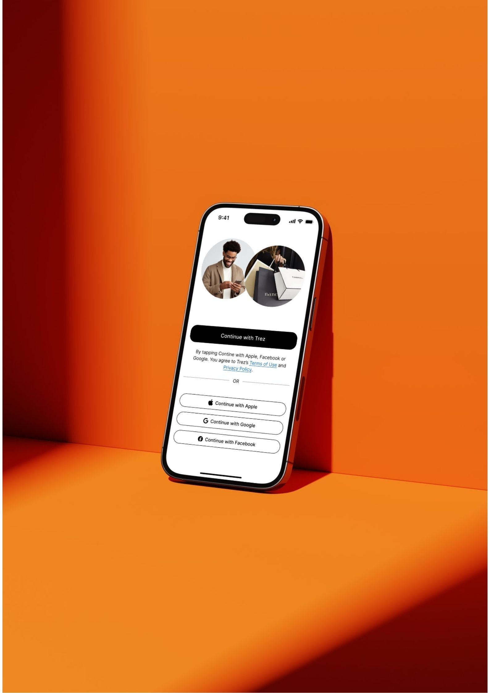
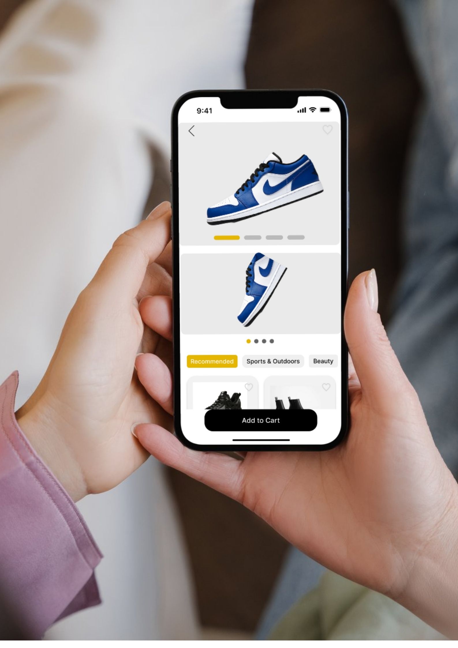
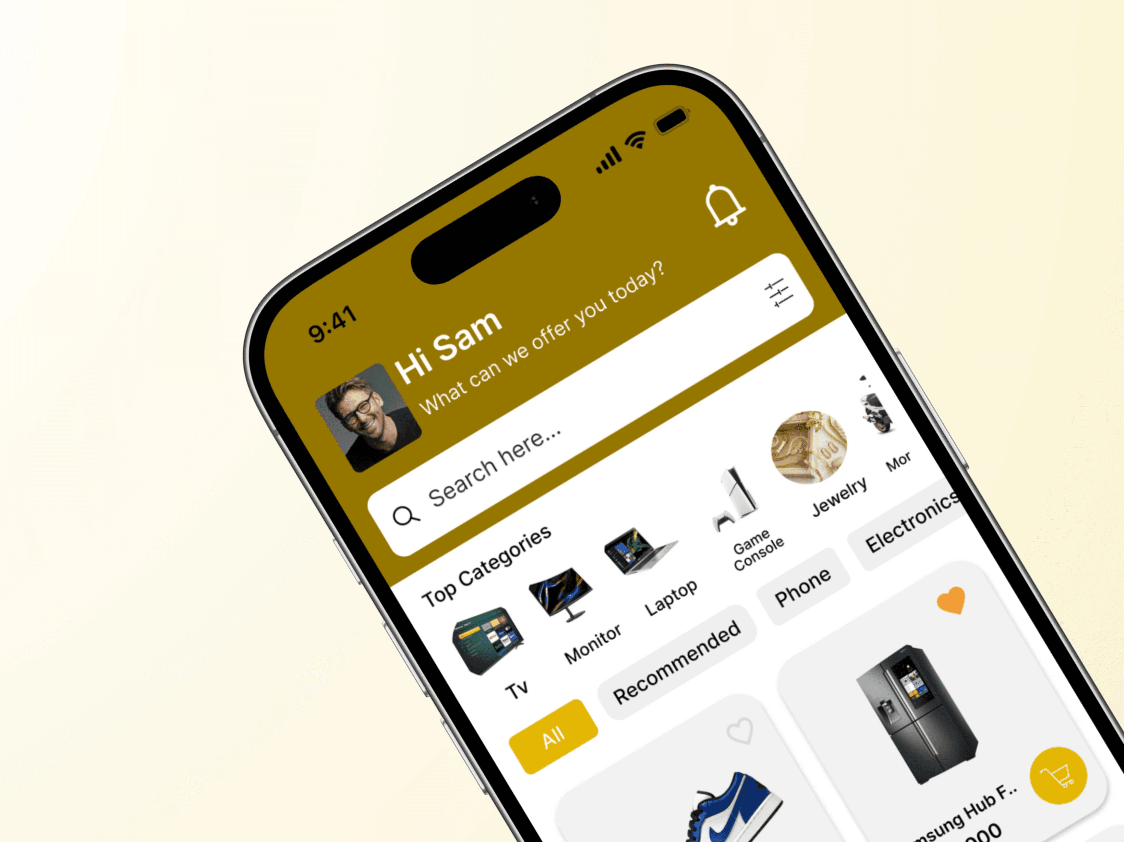
  • Once the flows were tested and refined, I moved into high-fidelity UI design. I created a modern, consistent visual language that emphasized simplicity and trust. Key visual decisions included:

    • A neutral, soft color palette for a calm shopping experience

    • Clean, readable typography for product details

    • Large, high-quality product imagery

    • Familiar, intuitive iconography and components

    The design balanced aesthetic appeal with functional clarity — aiming to reduce cognitive load and create a frictionless experience from browsing to checkout.

Stage 5. Implementation

  • In the final phase, I prepared the full UI kit, design system, and annotated screens for handoff. I documented component behavior, interactions, and responsiveness to ensure a smooth collaboration with developers.

    I worked closely with the dev team to clarify edge cases, align on screen transitions, and ensure that the live product stayed faithful to the original design intent.

Reflections

This project was an invaluable opportunity to apply UX/UI design principles in a real-world setting, contributing to a product that promotes social connectivity and culinary exploration. It challenged me to think creatively about how to meet user needs and preferences, enhancing my skills in research, design, and collaboration. The experience underscored the importance of user feedback in the design process and the impact of thoughtful design on user engagement and satisfaction.

Other projects

SAMx - © Copyright 2025.

SAMx - © Copyright 2025.

SAMx - © Copyright 2025.

Create a free website with Framer, the website builder loved by startups, designers and agencies.